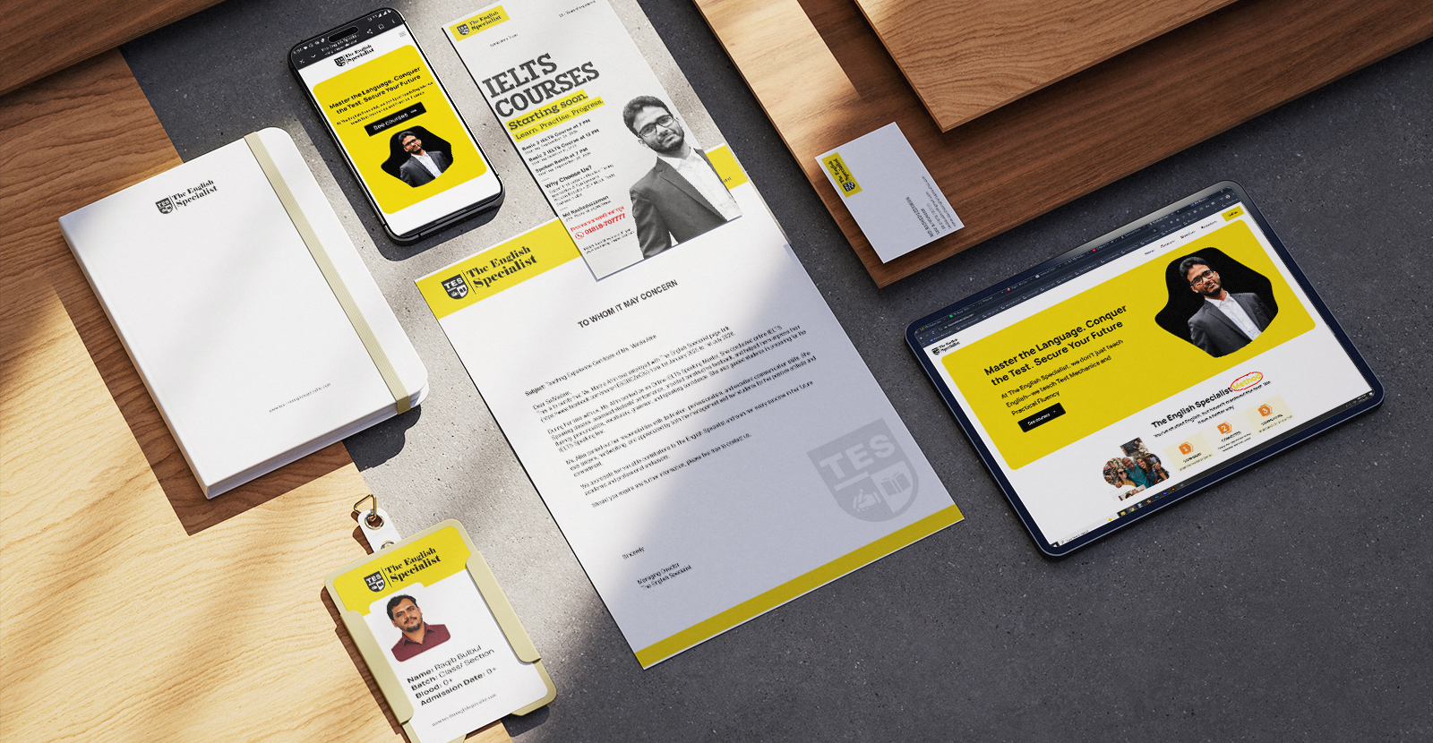
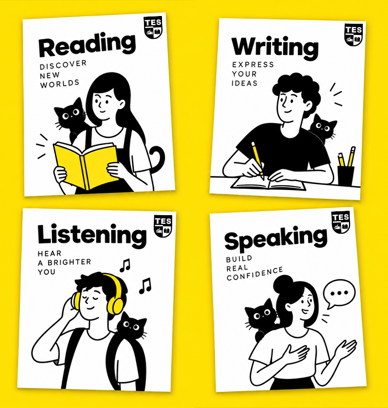
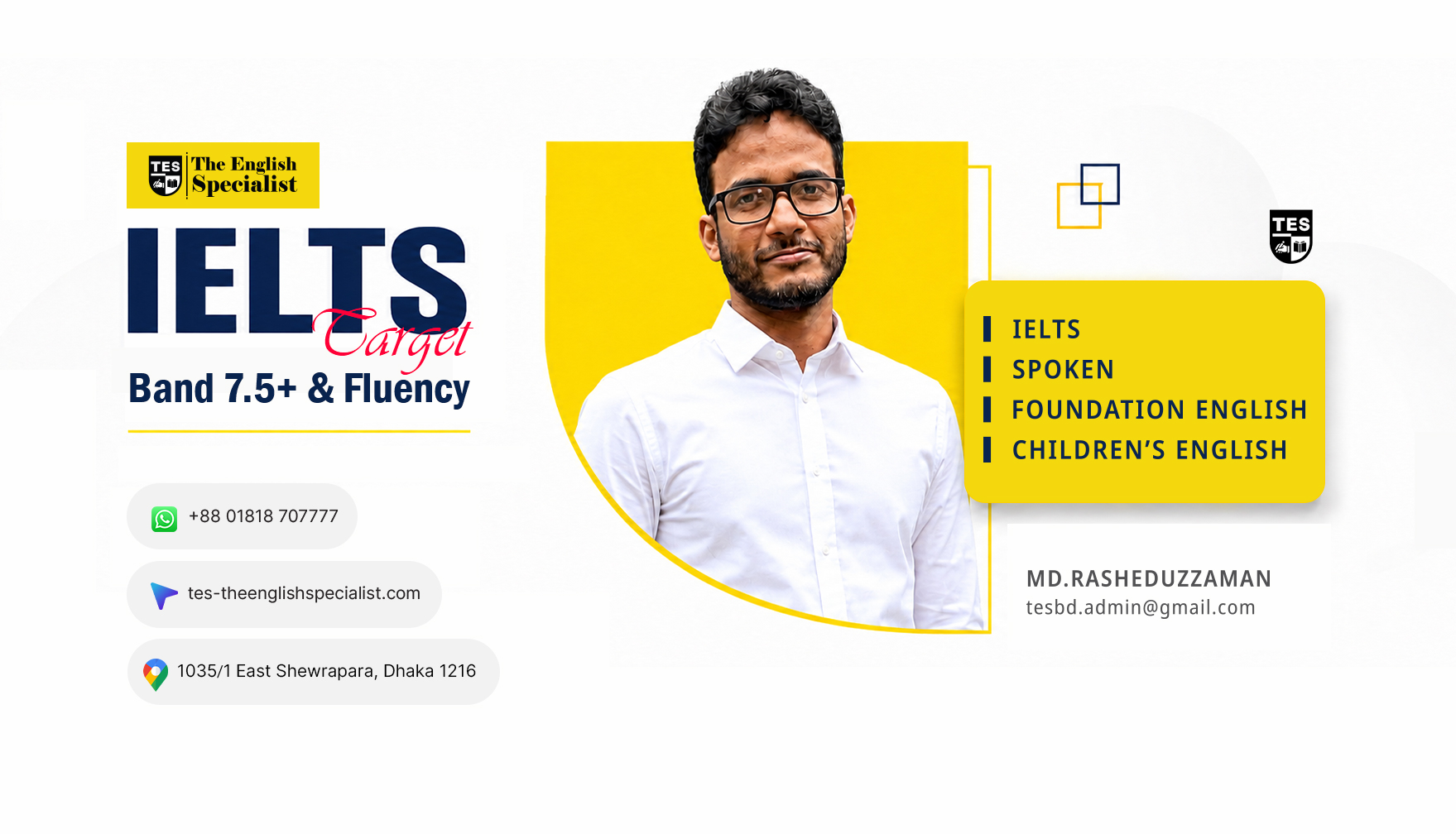
More than 26 years of teaching experience, brought together through one clear identity. I developed the complete brand experience for TES — The English Specialist, from its logo and visual language to campaign materials and website.
From Identity to Learning Experience
I designed TES as a confident and approachable education brand for students preparing for IELTS and wider international opportunities. The identity needed to communicate experience, structure and progress without making English learning feel distant or intimidating.
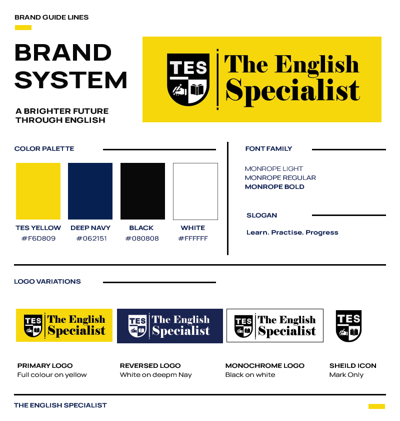
The shield-shaped logo brings the central idea together. The TES name establishes recognition, while the writing hand and open book represent practice, knowledge and the two essential sides of language development. Yellow gives the brand energy and visibility, while black and white keep the communication strong, direct and easy to recognise.
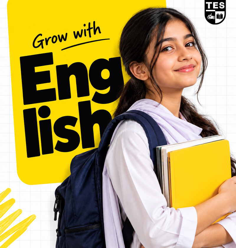
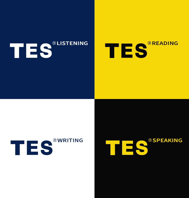
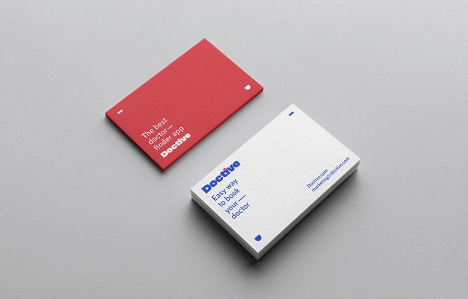
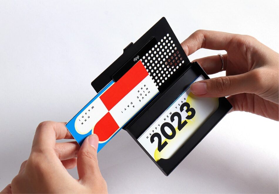
I extended the identity across course promotions, educational posters, social-media campaigns, printed materials and classroom communication. A consistent system of colour, typography, imagery and structured layouts allows different messages to remain connected to the same brand.
The website completes the experience by presenting TES’s IELTS Regular Prep, Online Interactive, Crash Course and Executive Coaching programmes through a clear and accessible digital journey. From the first logo sketch to the final website, every element was designed to help TES communicate its experience, guide its students and grow with confidence.